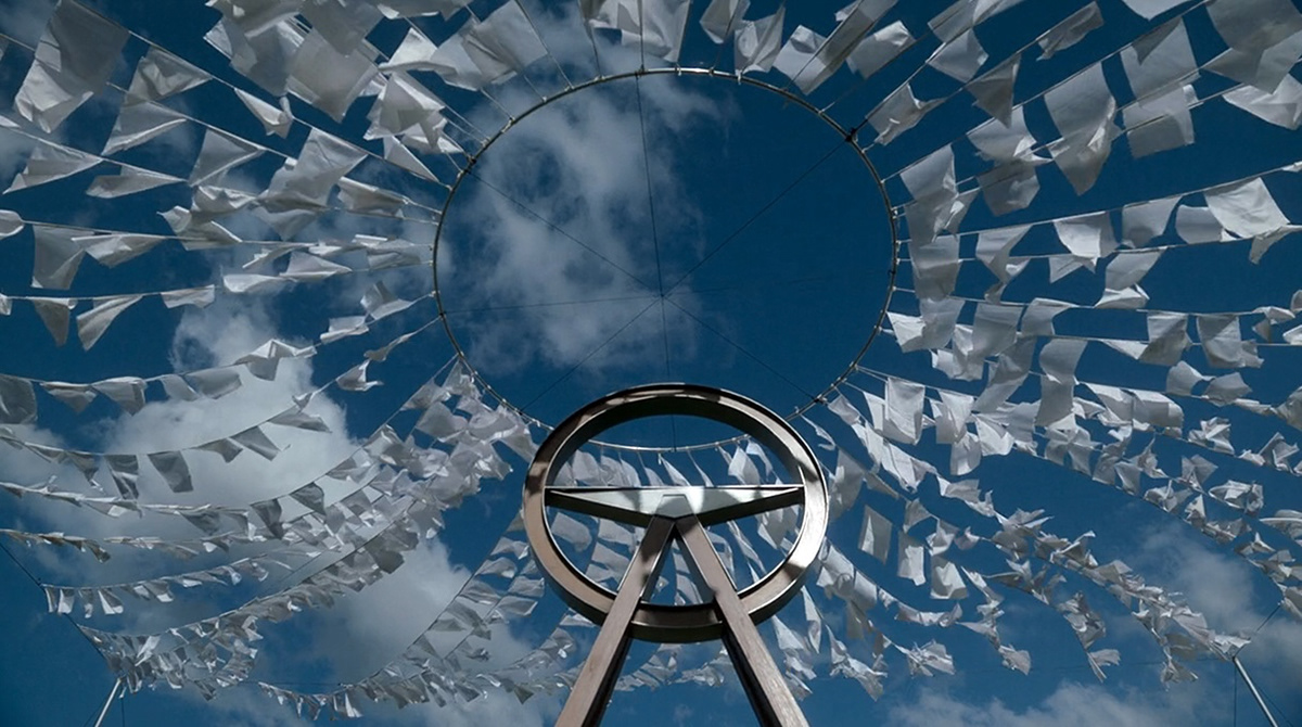
The Clearing
ROLE Graphic Artist
PRODUCTION DESIGNER Pete Baxter
RELEASED Disney+, 2023
SCOPE Graphic props, packaging design, photo editing, poster design, visual identities, environmental signage, screen graphics.
Based on J.P. Pomare's novel inspired by Victoria's infamous "The Family" cult, Disney+ series The Clearing spans multiple decades, demanding a distinct, era-shifting visual world. My work required navigating design styles across the 1980s, 90s, and present day, heavy on physical distressing and era-specific printing methods to signal time shifts.
The graphic scope ranged from crafting Victoria Police identities for two different eras to building the entire visual language of the cult to creating state-specific signage to transform Melbourne filming locations into South Australia.


From the Archives
A major hero prop for the series was a police archive box retained by an officer decades after the initial investigation into the cult. Working closely with the props team, I generated a full suite of graphic assets, including evidence folders, edited photographs, legal paperwork, and newspaper articles for them to physically print, age, and distress. Every document was styled to reflect organic wear, spanning original creation in the 80s and 90s through to decades of handling prior to its present-day screen reveal.

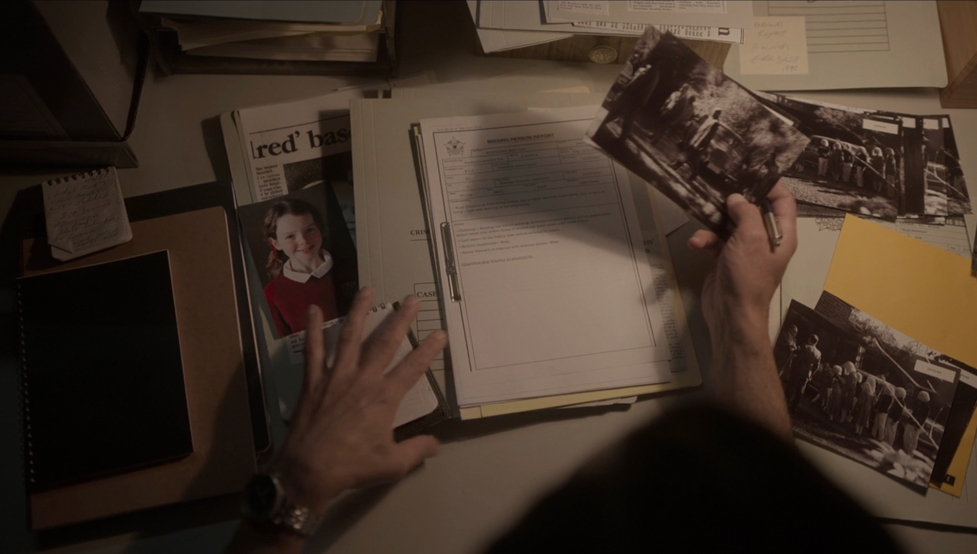
Graphic props (included edited photos) for a 1980s scene.
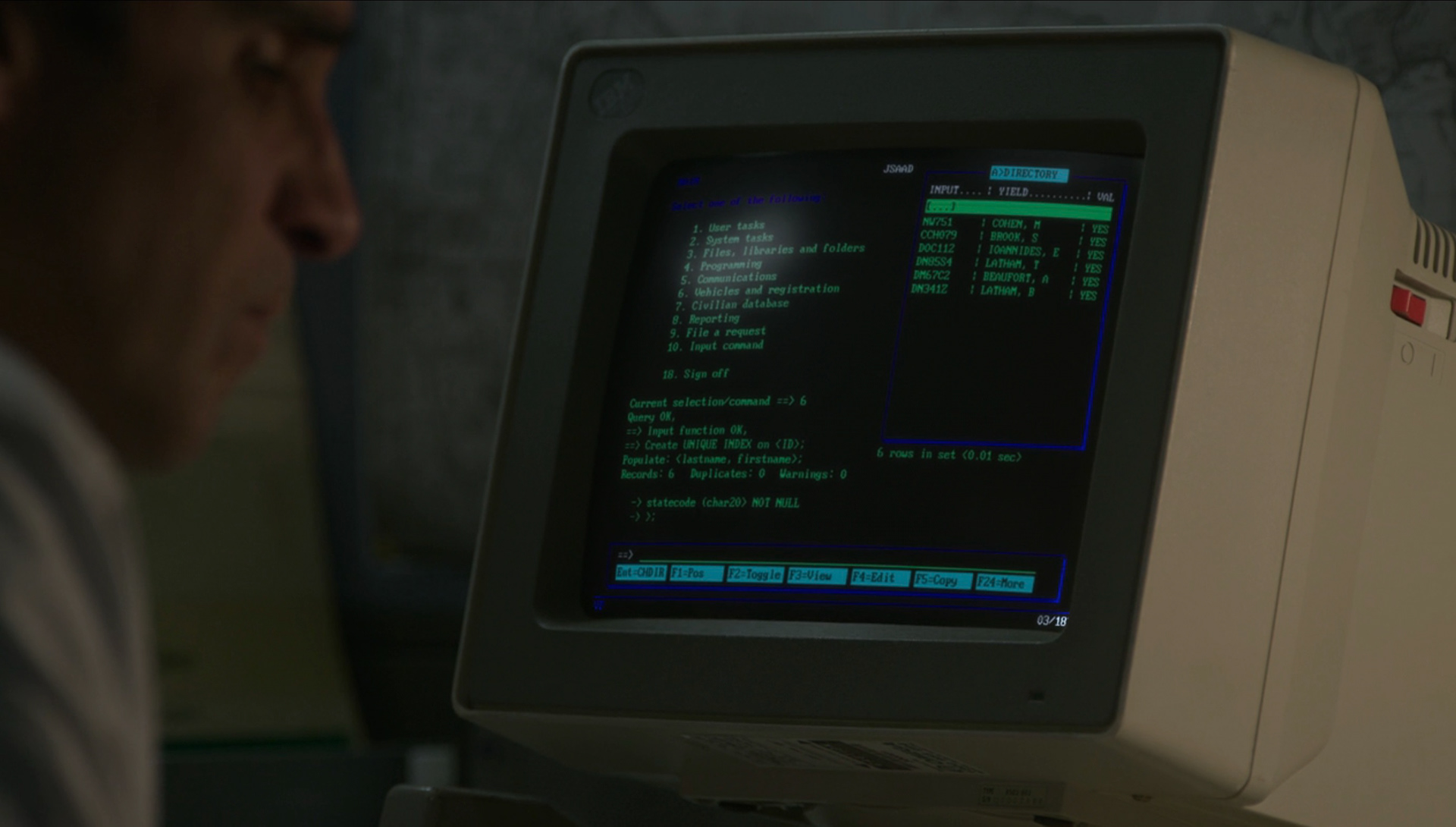
1980s police screen created in Photoshop.
Medicinal LSD
During the 1960s and 70s, LSD was incorporated into the cult’s spiritual rituals, with former members describing its use in initiation ceremonies and the reinforcement of Hamilton-Byrne’s supposed divine status.
In the series, the LSD was sourced from a cult member who worked as a psychiatrist.
I collaborated with the props master to develop our interpretation of how the drug might have been packaged for medicinal use, balancing the historical context with the visual requirements of the production.
In the series, the LSD was sourced from a cult member who worked as a psychiatrist.
I collaborated with the props master to develop our interpretation of how the drug might have been packaged for medicinal use, balancing the historical context with the visual requirements of the production.


A selection of period graphic props including letters, birth records, prescription pad with business cards and airline tickets.
Cult Motif
Part of dramatising the story for television involved creating a visual motif for the cult. I built around a hundred iterations before landing on the final design, which included a simplified version for small-scale use and a detailed version for intricate props and dressings.
A focal point of this worldbuilding was a hero stained glass window featured throughout the series. I hand-sketched the initial layout on paper before meticulously rendering the final piece in Photoshop, adding realistic lead lines, colour variation, and faux glass textures.